Let’s have a trot!
Aesop’s fables are some of the most well known in the world and have been translated in multiple languages and become popular in dozens of cultures through the course of five centuries. They have been told and retold in a variety of media, from oral tradition to written storybooks to stage, film and animated cartoon versions—even in architecture.
Aesop for Children contains the text of selected fables, color pictures, video, and interactive animations, and will be enjoyed by readers of any age.
“Aesop’s Fables”—also called “the Aesopica”—are a collection of stories designed to teach moral lessons credited to Aesop, a Greek slave and story-teller thought to have lived between 620 and 560 BCE.
Our history
We’ve been crafting designs that are fresh and innovative to help business. Our main services include branding, advertising and website & apps design. Our designs are crafted to provide the best possible experience on any device. We’ve been crafting designs that are fresh and innovative to help business. Our main services include branding, advertising and website & apps design. Our designs are crafted to provide the best possible experience on any device.
Regarding aesthetics
Crafting designs that are fresh and innovative to help business. Our main services include branding, advertising and website & apps design. Our designs are crafted to provide the best possible experience on any device.
The most difficult thing is the decision to act, the rest is merely tenacity. The fears are paper tigers. You can do anything you decide to do. You can act to change and control your life; and the procedure, the process is its own reward.
— Annie, Hugoo china
Three fundamental aspects of typography are legibility, readability, and aesthetics. Although in a non-technical sense “legible” and “readable” are often used synonymously, typographically they are separate but related concepts.[41] Legibility and readability tend to support aesthetic aspects of a product.
Type design is a closely related craft, sometimes considered part of typography; most typographers do not design typefaces, and some type designers do not consider themselves typographers.
Color palette
In typesetting, color is the overall density of the ink on the page, determined mainly by the typeface, but also by the word spacing, leading, and depth of the margins.[40] Text layout, tone, or color of the set text, and the interplay of text with the white space of the page in combination with other graphic elements impart a “feel” or “resonance” to the subject matter. With printed media, typographers also are concerned with binding margins, paper selection, and printing methods when determining the correct color of the page.
- Text set in lowercase is more legible than text set all in uppercase
- Extenders (ascenders, descenders, and other projecting parts) increase salience (prominence)
- Regular upright type (roman type) is more legible than italic type.
- Contrast, without dazzling brightness, also has been found to be important, with black on yellow/cream being most effective along with white on blue.
- Positive images make handheld material easier to read than negative or reversed.
- The upper portions of letters (ascenders) play a stronger part in the recognition process than the lower portions.
Inscriptional and architectural lettering
The history of inscriptional lettering is intimately tied to the history of writing, the evolution of letterforms and the craft of the hand. The widespread use of the computer and various etching and sandblasting techniques today has made the hand carved monument a rarity, and the number of letter-carvers left in the US continues to dwindle.
In typesetting, color is the overall density of the ink on the page, determined mainly by the typeface, but also by the word spacing, leading, and depth of the margins.[40] Text layout, tone, or color of the set text, and the interplay of text with the white space of the page in combination with other graphic elements impart a “feel” or “resonance” to the subject matter. With printed media, typographers also are concerned with binding margins, paper selection, and printing methods when determining the correct color of the page.
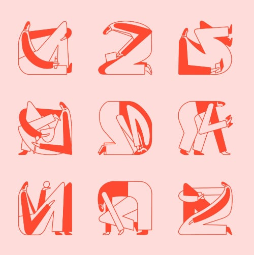
Display graphics
Color and size of type elements may be much more prevalent than in solely text designs. Most display items exploit type at larger sizes, where the details of letter design are magnified. Color is used for its emotional effect in conveying the tone and nature of subject matter.
Type design is a closely related craft, sometimes considered part of typography; most typographers do not design typefaces, and some type designers do not consider themselves typographers.
Leave a Reply